


‘If you say “dashboard” one more fucking time, I’m gonna kick you out of the building,’ I threatened.
That finally convinced the sales head of the SOFReady team to shut up. Six months before, I’d written a long and detailed critique of their software and suggested ways to make it useful and viable. My commander mistook this to mean I wanted to volunteer my battalion to host their sales team. I ended up spending most of the first half-an-hour trying to dialogue with the lone coder they brought with them, but the sales guy kept interrupting her every time she tried to answer.
Stunned by my rebuke, the salesman open and closed his mouth a couple times, baffled as a carp. His shock was likely because ‘dashboard’ was the magic sales word that had worked so well on other commanders. Seeing his dejected expression, I tried to mollify him. ‘They’re just fancied up PowerBI charts, calm down.’
Personally, I haven’t found dashboards very useful. This despite having been part of a team which built one ourselves for our commander when I was a major.
Apparently, I’m in good company. Last week Storm King Analytics published a great piece about their shortcomings — the inspiration for this post. When I restacked it, Sean Harper over at War Quants echoed with his sentiment:
100% of the military dashboards I’ve made for decision makers were dropped after a couple of months and they returned to PowerPoint slides made by staff officers.
In response to our posts, fellow NSTR alum and initiator of the Harding Project Zach Griffiths reached out for ideas to bring data literacy to his new command:
‘I’m trying to get my battalion to a live data command and staff. Is that a dashboard or something else?’
Well, to all those out there like Zach, here’s my best offering.
What Is A Dashboard?
A dashboard can be helpful in specific situations. If done well, they can answer your questions at a glance. But they only help you answer questions already asked. I’ll hit more on this in a bit, but first, what makes for a good dashboard?
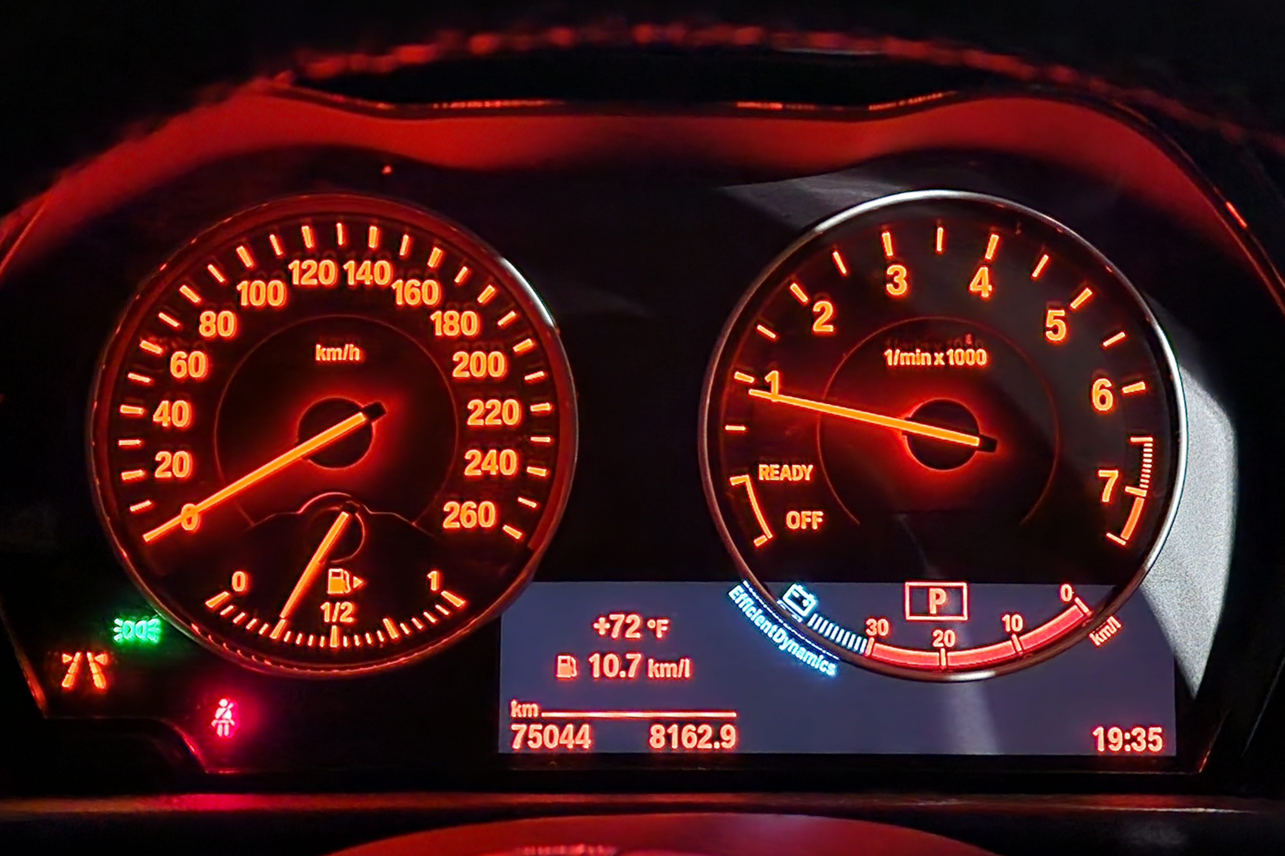
Start with the term’s namesake and go sit in your car. Look at two things:
How many different indicators are there?
How are they different?
Good dashboards only have a handful of indicators, because they’re trying to avoid information overload. On my car, only seven are always on: speed, fuel, RPMs, battery, odometer, temperature, and time. There’s probably at least seven more that come on when they need my attention — seat belt, turn signal, check engine, etc — but are otherwise dark.
Seven things can be a lot to look at — most humans struggle to keep more than four things at a time in their working memory — so the size of the indicators is used to dictate our focus. Speed is given prominence, both in size and location on the left, the position most English speakers read from. Fuel is important enough to get an additional secondary indicator that kicks on when it gets really low. But fuel only gets just 1/6th of the dial that the km/h does. This is because how fast you are going it probably the most important decision you make in a car, and the one you make most often.
Battery and RPMs are only important when something’s wrong, so they are stuck sharing the same dial. Every other indicator is tiny in comparison; there to be available when you want them and ignored the rest of the time.
Unfortunately, most of the dashboards I’ve seen across the military are visual train wrecks. Sven Balnojan hits their primary failing in his own takedown:
‘Your dashboard isn’t a Christmas tree.’
Bad dashboards are weak attempts to pretend a command is data driven. They try to look busy by pulling in every piece of data you can into a single screen so densely packed with colors and text that you can convince yourself you’re seeing anything.1

I can usually tell how analog a command is just by looking at their dashboard. I can also predict with strong confidence the odds their underlying data is shit.
What Are You Deciding?
When we go back to the example in your car, all the indicators are there to answer a question and drive a decision. There isn’t an indicator that is tracking how many times your turn signal has blinked, nor a light which turns on when your car’s cup holders are 75% filled. Your car’s dashboard has been edited down to just the things that help you make the decisions you need to make while driving.
Meanwhile, military dashboards are too often just littered with pieces of flair. Too many pie charts that don’t drive decisions. We’ve taken stale PowerPoint charts with meaningless percentages and replaced them with a patchwork of colorful charts with equally meaningless slices. You might be saving your command a small bit of time by having the stats update automatically instead of by hand via PowerPoint, but they still don’t drive a decision.
You’d be more effective examining what stats you’re using to make decisions in the first place. As I stated above, a dashboard can only answer a question you’ve already asked. The ironic part is we often call these ‘commander’s dashboards’ when there’s nothing command about them. An indicator can change from amber to red when a stat hits 70%, but what does that mean? What decision does it drive? Red means action must be taken, but what? All those colors and bars and stats and all they are telling you is ‘check engine light’ — something is wrong, but you’re going to need a specialist to tell you what to do about it.
We do this all the time in meetings like command and staff. What does it mean when the box for Alpha company’s Cyber Awareness is only 95%?2 What about when Bravo Company’s NCOER’s box drops to 77%? What specifically should they do?
Contrast that lack of clarity with what a team that works with real data can do. To prepare for our 100% inspection of Army Family Housing, we built a table for here in Zama, and the Department of Public Works (DPW) team quickly input all the information we had on every home, to include the name, rank, units of the residents.
But we didn’t bother making a dashboard out of the data, because that wasn’t going to help me drive action. I didn’t need to tell my fellow commanders what percentage of their formations still needed to sign up. I needed to tell them who. So, we just used the raw data, and with a week left before sign-ups closed, I was able to send each command a list of everyone who still needed to take action.
There is perhaps nothing which brings joy to a command sergeants major’s heart like a by-name-list of soldiers who are out of tolerance. Within days we were down to just a handful of stragglers.
Compounding Returns
But the real advantage to working with data came a couple days later when the senior commander asked me a different question entirely.3 He wanted to know something else about next year, and the years after. We didn’t have a dashboard dial to tell me that, because neither my team nor I had anticipated the question. But with just two minutes of poking at my team’s database, I could give the commander a rough answer. No phone call to the DPW team, not 24 hours later after everyone had checked their emails. Just two minutes with a couple slicers.
And then, later that week, another director came to me and brought up the housing database. Our emergency services team handles guest passes on post. Under the old process, someone requesting a pass would first come to our visitor’s center, but then drive over to housing to confirm their residency, only to drive back to the visitor’s center to turn that in to get their approved pass.
An ICE comment brought the inefficiency to my attention, and I’d tasked my director to see how we could streamline the process. The director noted as long as the housing database stayed accurate, his team could check it right there on the spot in the visitor’s center. One simple database was reaching across directorates to save everyone time. Soon we were musing how to modify the onboard / offboard process to automatically update the database. Making the work do the work, which would both improve our data and save us even more time.
PowerPoint Narcan
Everybody has a dashboard in their car. That doesn’t make them data literate. When I wrote my first article in War on The Rocks, I didn’t propose giving every commander a dashboard. I argued we needed data literate commanders; leaders who can look at data use it to make decisions, who can link up disparate streams of information to generate new insights.
My yearlong sabbatical is over and I’m back at work — hence the sporadic posts. Like all my previous assignments, PowerPoint was the lingua franca when I got here. I’ve been working to kill it wherever I can, and even seen some unexpected early successes.
But weening an organization off PowerPoint takes a lot of work, and I don’t think dashboards are the best means to detox. This is because what we really need is to tell stories with our data. Storm King’s ended his post by calling for us all to reflect:
‘Am I showing data, or telling a story?’
This echoed exactly what I first heard Natalie Stone argue in a brown bag lunch session.
‘Data visualization is first and foremost about the story you want to tell. Is the story you want the audience to take away, the same story you believe you are communicating?’
Last year, we were so floored by her pitch when we first heard it, we had her repeat to for the entire Drink, Think, Write, Fight team. And then I invited her onto Downrange Data for two guest posts. Natalie laid out that data driven decision making is built on the ability to tell truer stories, to ourselves and to others.
Dashboards can be a tool for that, but for me dashboards are giving someone fish, versus teaching them. I want all the members of my team to be able to answer questions and drive decisions. Real data literacy, working with the data itself, is the way to help them do that. It also enables them to tell stories together, like above when two directorates start sharing the same database for different reasons.
Dashboards don’t do that.
I used this trick to bamboozle our battalion CSM back when I was a lieutenant.
If I could convince the army of one rule it would be that 92% = 100% current on all annual requirements. This is because 1/12th is 8%, i.e. a rough guess on how much of your formation is always out of tolerance for anything they have to do every year.
Army garrisons work for two commanders. One is Installation Management Command (IMCOM) back in San Antonio. The other is the Senior Commander (SC) who is normally, but not always, the senior general officer at the installation.
Thank you for writing this. There is a third reason to be suspicious of the dashboard approach to leadership, and that is the dashboards can often mislead commanders into believing that they can know things that in fact they cannot. Ground zero for this delusion is readiness reporting, which at times is treated in a dashboard like way but owing to imperfect measures and the speed at which readiness changes usually misleads the commanders using the dashboard.
Thx for the "shout out." Keep fighting the "good fight." :-)